
Retail Design For Success
- Ashish Anand
- Oct 18, 2021
- 6 min read

Updated: Feb 16
Overview of Retail Design
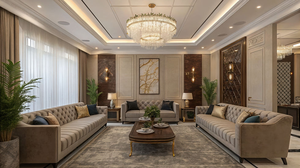
Retail design is a crucial aspect of creating an engaging shopping environment that enhances customer experience and drives sales. It encompasses various elements, including layout, aesthetics, branding, and functionality.
Key Elements of Retail Design
Store Layout: The arrangement of products and pathways influences customer flow and accessibility.
Visual Merchandising: The use of displays and signage to attract customers and promote products.
Lighting: Proper lighting enhances product visibility and creates an inviting atmosphere.
Color Schemes: Colors can evoke emotions and set the tone for the shopping experience.
Materials and Finishes: The choice of materials impacts durability, aesthetics, and overall brand perception.
Branding: Consistent branding throughout the store reinforces brand identity and values.
Trends in Retail Design
Sustainability: Increasing focus on eco-friendly materials and energy-efficient designs.
Technology Integration: Incorporating digital displays and interactive elements to enhance customer engagement.
Experiential Retail: Creating immersive experiences that go beyond traditional shopping.
Flexible Spaces: Designing adaptable areas that can be reconfigured for different purposes or events.
Importance of Retail Design
Retail design plays a significant role in:
Enhancing customer experience and satisfaction.
Encouraging longer dwell times and increased spending.
Strengthening brand loyalty and recognition.
Optimizing operational efficiency and staff productivity.
Conclusion
Effective retail design is essential for attracting and retaining customers. By focusing on key elements and staying updated with current trends, retailers can create spaces that not only showcase their products but also provide memorable shopping experiences.
Merchandise will sell itself when a store’s design is good, but when it’s not, even the best product can sit and gather dust. The purpose of a store’s design is not merely to look pretty; it’s to attract customers, entice lingering and encourage spending. Professional store planners know every single square foot of your sales floor has a specific job to do; you will too after reading these tips and hints from a retail expert, Architect Ashish Anand.

CHOICE OF COLORS
Two kinds of colours are used in-store decor: neutral/primary colours and bold/secondary colours. Neutral colours are used in 80 per cent of the store’s decor to create a relaxed shopping atmosphere. Secondary, or accent, colours are used in 20 per cent of the store to make it pop. Think of accent colours as attention grabbers.
A retailer once asked me to look at photos of his newly remodelled store. He had hired an interior designer with wild ideas, and the entire store was red. That much exposure to a dominant colour makes most people antsy. I asked the retailer to spend two weeks watching how long customers stayed in the store. As suspected, customers didn’t stay any longer than they had to, and the retailer had to redo his entire store to get sales back on track.
THE DECOMPRESSION ZONE
The decompression zone (DZ) is the space that’s located just inside your front door. The size of your DZ will depend upon the size of your sales floor, but it’s generally the first 5 to 15 feet inside the front door. Its purpose is to give shoppers a chance to transition from whatever happened in the parking lot to your store—it refocuses the customer on shopping. Your DZ needs to be open, inviting and easy to navigate. Understand that shoppers will miss anything you place here; that’s why the DZ is not the ideal place for shopping baskets or sign-up sheets because customers will blow right by them. Instead, place these items just outside your DZ.
ATTENTION! RIGHT TURN AHEAD!
Indians shop the way we drive—we have a tendency to turn right when we enter a store. About 90 per cent of customers do this, travelling around your store in a counter-clockwise pattern. So it’s important to merchandise the area directly to the right of your store entrance with care. This is where you’ll want to place your top profit-making products.
LOOK TO YOUR RIGHT—IT’S YOUR FIRST POWER WALL
Just after the decompression zone, look to your right, and you will see the first Power Wall. That right-side wall is another one of those key merchandising areas because it’s the first wall shoppers see after entering the store and naturally turning right. The wall is a perception builder, and if you use it to house basic products, you are making a mistake. Put your best foot forward by using this Power Wall to display important merchandise, show off new and seasonal items, create vignettes and feature high-profit items. (Note: Your store has more than one Power Wall. Stand in various spots and look around; the walls that stand out are your Power Walls.)

DECIDING THE RIGHT LAYOUT FOR YOUR STORE
All store layouts are affected by the shape and size of the sales floor, but the common goal is to expose shoppers to products and to gain maximum traffic flow. Three layouts are typically used in-store design: grid layout, loop (racetrack) layout, and free-flow layout.
In a grid layout, fixtures run parallel to the walls, so customers typically grab a shopping cart, start in a front corner and walk each and every aisle. Grid layouts are easy to shop because they offer clean sight lines throughout the entire store. Another plus: grids allow for maximum end feature exposure. Grid layouts can be found in grocery stores, but you will also find them used in large craft and general merchandise stores.
A loop layout offers a clearly defined main aisle that circles through the store like a racetrack. Fixture placement in a loop layout differs in different parts of the store. The perimeter fixtures run perpendicular to the wall, and the centre fixtures run parallel to the side walls. In a loop layout, shoppers typically flow to the right and move up and down the aisles in a serpentine manner. Loop layouts offer maximum product exposure because the perimeter walls are just as important as the end features—the layout leads customers to the wall each time they go down an aisle.
Speciality retailers typically use a free-flow layout because it allows for the most creativity. In a free-flow layout, there are no set aisles or straight lines. Instead, fixtures are placed at angles, encouraging shoppers to easily move throughout the store, where they will find new merchandise displays at every turn. This layout offers many opportunities to romance the merchandise and creates lifestyle display vignettes.
A WORD ABOUT STORE FIXTURES
When it comes to storing fixtures, keep this in mind: it’s dangerous to fall in love with your store fixtures. Remember that the true purpose of your fixtures is to house merchandise; you aren’t supposed to see the fixtures, so don’t make them the star of the show.
SPEED BUMPS
Just past the decompression zone is where you place fixtures known as speed bumps. These merchandise displays work much the same way as speed bumps in parking lots —they slow customers down. They also grab their attention and introduce them to the cool products for sale in your store. Speciality fixtures, such as four-way gondolas, make great speed bumps. Small tables work well, too. Use speed bumps to feature new and seasonal items and to tell product stories. Rotate the merchandise on your speed bumps at least once a week.

DON’T PUT THE CHECKOUT COUNTER THERE!
A common mistake in-store layout is placing the checkout counter at the centre front, or right front of the store, smack dab in the middle of your lakefront property. Your checkout should be located at a natural stopping point in the shopping experience: the left side of the store, close to the front. And your checkout counter should be designed to sell! Embrace these four rules:
Provide shoppers ample space to comfortably complete their transaction
Showcase an interesting display behind the counter so customers can continue to think about the product while waiting
Keep your policy signage inviting, polite and positive
Load up the counter with “I have to have this!” impulse items.
MERCHANDISE OUTPOSTS
Next time you’re in a grocery store, keep an eye out for product displays that are placed near or in the aisles. These fixtures are called merchandise outposts, and their sole purpose is to encourage impulse purchases. Merchandise outposts make shoppers think, “I need that!” They provide the perfect opportunity to cross-merchandise.
PUTTING IT ALL TOGETHER
After you read this article, take a trip to your local mall and study the bones of each store. You will see how these universal store-planning truths have been tweaked for each application. And they will work in your store as well. Whether you are gearing up for a new store, or just in need of a sales floor shuffle, remember that you are not alone. If you’re not sure what to do first, give us a call, or e-mail photos and we’ll share ideas to help get you started.


Comments